
Why You Should Spend Time Making Your Framework Look Beautiful
Hint: Avoid using bullet points

If you’ve ever been on the receiving end of a corporate presentation, you’ve probably seen a bullet point-based framework slide like this:
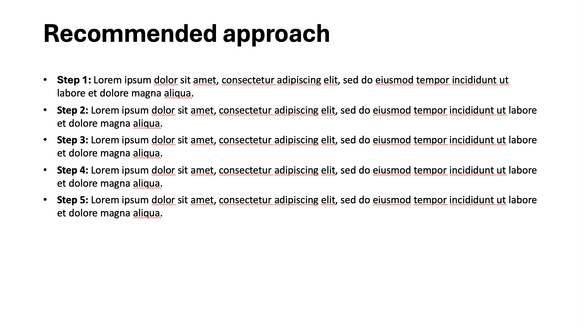
It’s clean.
It’s factual.
It’s... completely forgettable.
Let’s not sugar-coat it: bullet points are the fast food of business communication. They fill space, they deliver the basics, but they rarely leave an impression. When you’re presenting a process, a framework, or a recommendation that took weeks of thought and effort to develop, is that really how you want to showcase it?
We are going to show you a better way — one that not only clarifies your thinking but also earns you credibility with senior stakeholders. It takes the same five steps listed above, but presents them in a way that feels designed, intentional, and memorable.
Let’s walk through how to do it — and why it matters.
The Problem With Bullet Points
Bullet points are easy to write and easy to read. That’s why we default to them. But they also flatten your message. They suggest that every item is equally important, disconnected from the others, and independent of any underlying logic or structure.
When we present a process — especially one with sequential steps — we’re often trying to do three things at once:
Communicate the sequence (what happens first, second, etc.)
Reinforce the relationships between steps
Create a visual memory anchor for the audience
Bullet points do none of those well. They’re linear, yes — but they’re also abstract. They make your work feel like it came out of a textbook, not from deep thinking or collaboration.
What Better Looks Like
Here’s the slide we’re going to build instead:
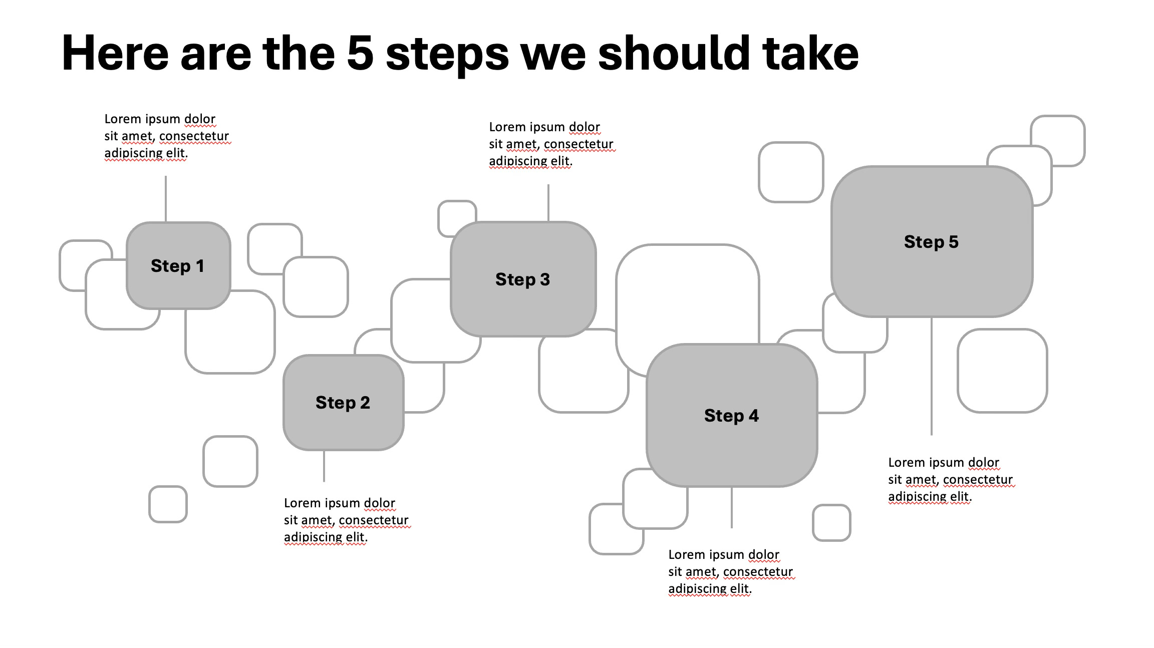
This is what you can call an “elevated process visual.” It’s still just five steps. But the design and layout transform how the content is perceived.
Let’s break down why this works — and how to create something similar for your own work.
Step 1: Use layout to reinforce structure
The first thing you notice is the visual flow. The steps are arranged left to right in a staggered pattern. This isn’t just for aesthetics — it suggests motion and progress, which is critical when communicating a multi-step approach.
Even more importantly, it signals that someone thought about how to lay this out. It doesn’t look like default PowerPoint formatting. It looks designed. That creates trust. It says: “We cared enough to make this clear.”
💡 Pro tip: Always ask yourself: What is the visual logic of this slide? If the answer is “top to bottom list,” you’re probably defaulting to bullets.
Step 2: Create consistency in shape and labelling
Notice that each step is presented inside a soft-rounded rectangle with a consistent size, font, and label style (“Step 1,” “Step 2,” etc.).
That consistency gives your viewer something to latch onto — a rhythm. It makes it easy to follow the flow and compare elements. It also makes the slide feel more polished and intentional.
💡 Avoid: Mixing icons, varying text sizes, or using decorative shapes just for flair. Visual consistency is your best friend when conveying structure.
Step 3: Use the background to suggest depth (without clutter)
You’ll notice the background features abstract square shapes in various sizes and opacities. These don’t carry specific meaning — they serve a different purpose: depth.
This kind of background breaks the monotony of a blank canvas without overwhelming the core message. It gives the slide a layer of visual sophistication that makes it feel designed rather than assembled.
Think of it as setting a stage: your content is the actor, but the background is the lighting and set. Done well, it elevates everything.
💡 Tip: Use subtle patterns or shapes to build depth. Don’t overdo it — the background should never compete with the main content.
Step 4: Add supporting text — but only where needed
Each step is paired with a small amount of supporting text underneath. Not full sentences. Not long paragraphs. Just enough to clarify or expand.
This is deliberate. Viewers read slides differently than they read documents. They scan. They latch onto what’s bold or centered. Supporting text should be there if and when the reader needs it.
What this does:
Keeps the slide visually clean
Allows deeper understanding for those who want it
Shows that you’ve thought about both the “what” and the “why”
💡 Guideline: If you need more than 2 lines to explain a step, your audience probably needs a second slide — or you need to simplify.
Step 5: Anchor your headline in action
The headline says: “Here are the 5 steps we should take.” It’s simple, direct, and action-oriented.
Compare that to more generic headers like “Process overview” or “Recommended approach.” Those say nothing.
Good headlines do work. They don’t just title the slide — they frame the slide. And in this case, they make it immediately clear what the viewer is about to see and why it matters.
💡 Best practice: Use your slide title to answer the question: What should the audience take away from this?
Why This Works With Senior Stakeholders
There’s a reason why professionals obsess over slide quality — because it signals the quality of your thinking.
A slide like this does a few things that bullet points can’t:
Shows synthesis – You’ve taken information and shaped it into something clear and visual
Demonstrates effort – You didn’t copy-paste bullet points; you constructed an argument
Builds memory – The visual layout helps people remember the steps and the logic
Creates shareability – A strong visual slide gets circulated. It stands on its own.
In high-stakes environments, slides are currency. The better yours are, the more weight your voice carries.
So, When Should You Use This?
You don’t need to do this for every list or every idea. But when you're explaining a key framework, process, or methodology — especially one you want to drive alignment around — this kind of visual is worth the effort.
Use it when:
You’re presenting a plan or roadmap
You want to show how different steps or workstreams relate
You’re introducing a “signature” approach (e.g., transformation model, diagnostic method, 100-day plan)
You want to stand out from competitors or internal teams using generic slides
Final Thought: Think Like a Designer, Not Just a Thinker
You already know how to break down complex ideas. That’s table stakes. What separates top-tier professionals is the ability to present those ideas in a way that sticks.
This isn’t about style over substance. It’s about using design to reinforce substance.
The next time you need to present a 5-step process, skip the bullets. Take 30 more minutes. Build a visual that tells a story. Your audience will thank you — and more importantly, they’ll remember what you said.
Want more frameworks, design tips, and communication strategies like this one? Subscribe to stay sharp.