
Everything I Know About the 7 Most Useful Charts in Business
The seven charts that never get old in corporate life.

One of the fastest ways to raise your game at work is to get sharper at visual communication. Most corporate professionals underestimate this. They spend weeks on analysis and then bury the insight inside a deck of confusing tables and spaghetti charts.
At McKinsey, one of the first things you learn is this: insight only matters if people can see it, understand it, and remember it. That’s where the right chart becomes a weapon.
Over time, we found that 7 chart types are disproportionately useful in day-to-day business improvement, strategy, and management contexts. If you can master these — both how to build them and when to use them — you’ll be miles ahead of most of your peers.
Here they are:
Horizontal bar chart
Vertical bar chart
Waterfall chart
Cost curve
Heat map
Process chart
Text buckets chart
Let’s go through each one.
1. Horizontal Bar Chart
A horizontal bar chart is one of the cleanest ways to show how a metric has shifted over time. Because we naturally read from left to right, it feels intuitive for the viewer to follow a progression: sales rising across quarters, EBITDA falling during a downturn, or headcount climbing over a decade. The metric itself can be anything — financial, operational, or even softer measures like employee engagement. What matters is that the eye can quickly trace change in the bars across the timeline without effort.
See an example of what it looks like below:
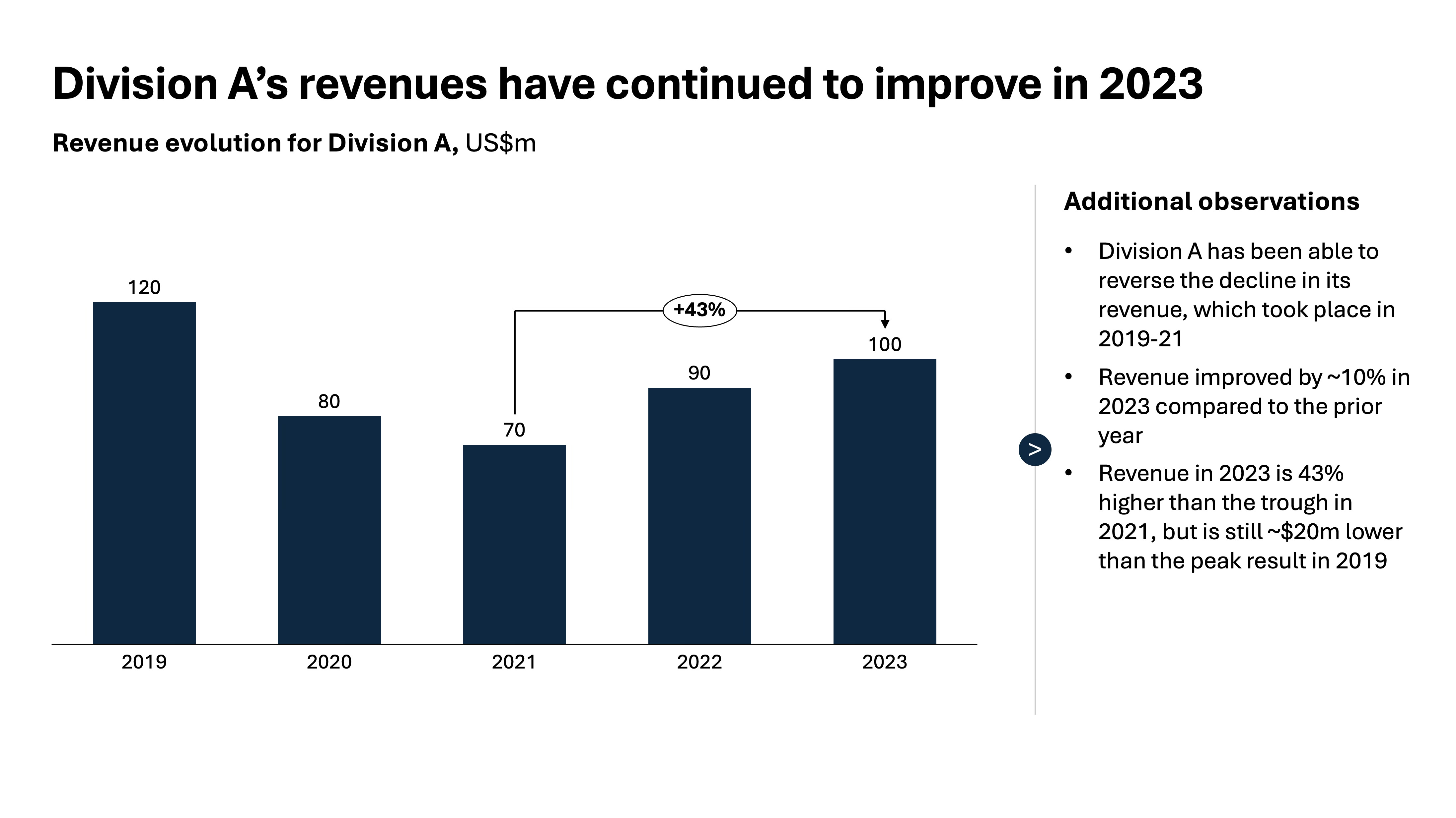
Another strength of the format is that you can layer more nuance into the picture by using color-coding within each bar. For example, an EBITDA bar might be segmented into subcomponents like different divisions, or a sales bar might show how much growth came from price versus volume. These sub-segments give richness to the story without cluttering the chart with additional lines or labels. The trick is to keep it simple: too many subdivisions and you lose the power of the overall shape.
Another common mistake is overloading the chart with too many periods. If you try to show every single month for 10 years, the viewer will get lost in detail and miss the forest for the trees. Instead, aggregate intelligently — roll months into quarters, years into five-year averages, or decades into eras. This forces clarity and makes the bigger story obvious. Conversely, avoid using horizontal bar charts to compare static categories, such as different business units in a given year. In that case, a vertical bar chart is a cleaner and more natural choice. Imagine a visual where EBITDA is plotted over a 10-year horizon with each bar broken into the main drivers — in three seconds the reader knows both how performance moved and what was behind it.
2. Vertical bar chart
A vertical bar chart comes into its own when you need to compare static categories at a single point in time rather than a trend over time. It’s the natural choice for showing how one period breaks down across business units, product lines, customer segments, or geographies. For example, if you want to illustrate how revenue in 2024 was distributed across five divisions, a vertical bar chart makes that comparison immediately clear — each bar is a category, each height a share of the whole.
Have a look at the visual example below:
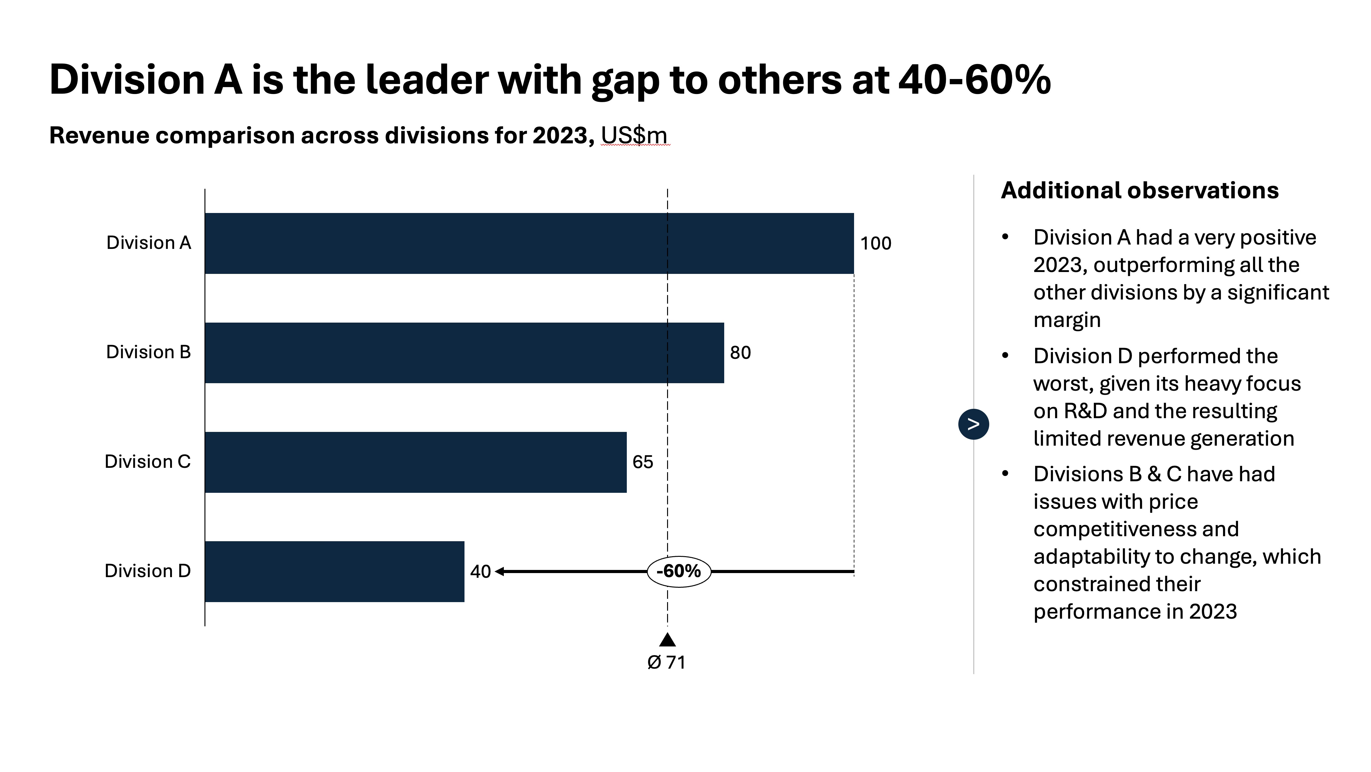
The strength of this format lies in its visual clarity. Our eyes are good at comparing heights when the categories are arranged side by side, and the layout reinforces the sense of distinct buckets of performance. It’s particularly effective when you want to highlight one category against others, either by color or annotation, because the difference is visible at a glance.
Where this chart can go wrong is when it’s overloaded with too many bars or when the scale is manipulated. Ten or fewer categories is usually ideal; beyond that the bars become indistinguishable and the insight gets lost. The scale should always start at zero, otherwise you risk misleading the reader by exaggerating small differences. Used well, a vertical bar chart is the best way to show the shape of a business at a given moment in time — who’s contributing most, who’s lagging, and where the story really is.
3. Waterfall chart
The saying goes that a waterfall chart is the consultant’s (or the strategist’s, or the BI professional’s) best friend when it comes to explaining how you get from one number to another. Instead of presenting totals that feel disconnected, the waterfall shows the journey step by step — starting with a baseline, then layering in the key additions and subtractions until you arrive at the final result. It’s also often used in finance: an EBITDA bridge, a revenue walk from last year to this year, or a budget variance analysis. But the principle applies widely — any situation where you need to show the drivers of change is a candidate for a waterfall.
Here’s what it usually looks like in practice:
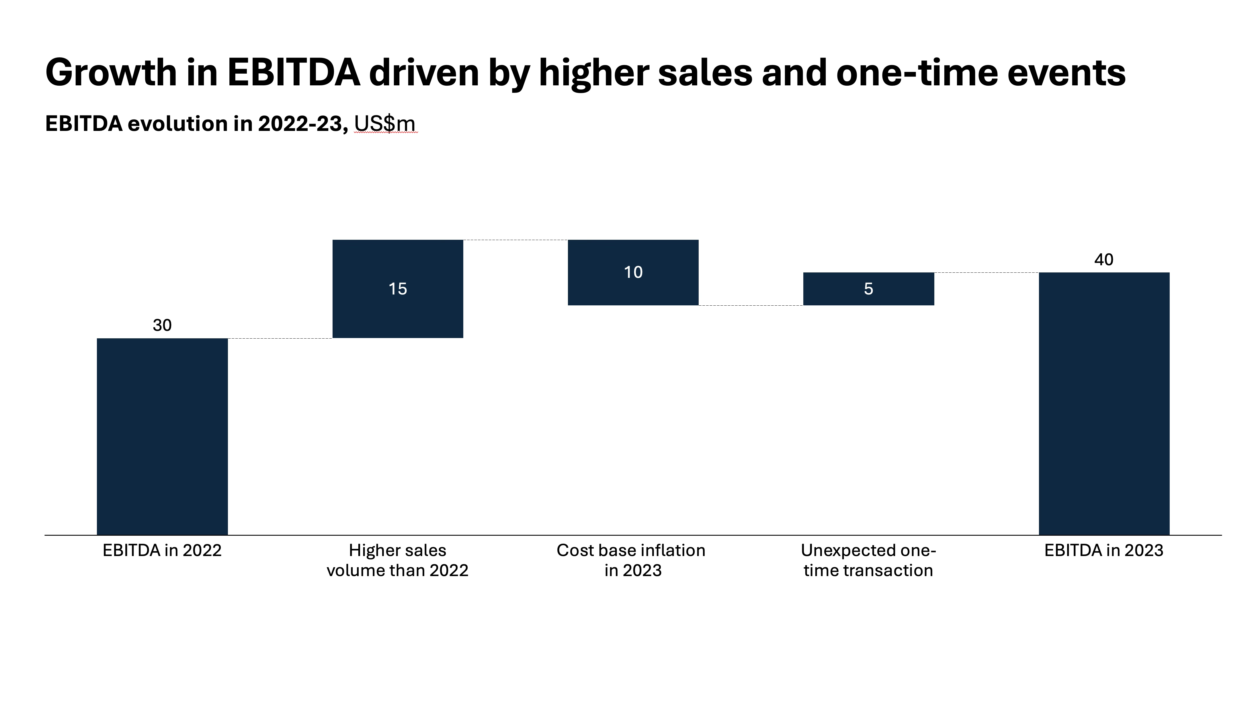
What makes the format powerful is its clarity. Each bar either pushes the value up or pulls it down, and by the time you reach the last bar, you know exactly why the number moved the way it did. Colors reinforce the message: green or blue for positive, red for negative, with the starting and ending totals clearly anchored. The reader doesn’t need to scan through a dense table or reconcile numbers mentally — the chart does the math visually. This makes it far more persuasive in executive discussions, where attention spans are short and the “so what” needs to be obvious.
That said, a waterfall chart only works if it is disciplined. Too many micro-contributors and the story fragments — aggregate the trivial items into one “Other” bar if needed. Always show the starting and ending totals; without them the logic collapses. And (in most cases) resist the temptation to use it for static breakdowns (like showing share of spend across suppliers) — that’s not its purpose. The waterfall is a storytelling device, designed to walk your audience through a narrative of change. Used well, it transforms what might otherwise feel like accounting detail into a clear, memorable story of performance drivers.
4. Cost curve
A cost curve chart is another staple in strategy and operations work, particularly when you need to show how one unit, plant, supplier, or competitor stacks up against others on cost efficiency. The logic is simple: you line up all the players along the x-axis, with the width of each bar corresponding to some measure of capacity (like annual production), usually ranked from lowest to highest cost per unit, and then plot the cost itself on the y-axis. The result is a curve that reveals the spread across the industry — who sits in the low-cost position, who’s in the middle of the pack, and who is at risk because they are sitting far out on the high-cost tail.
It might be easier to understand it visually, like in the example here:
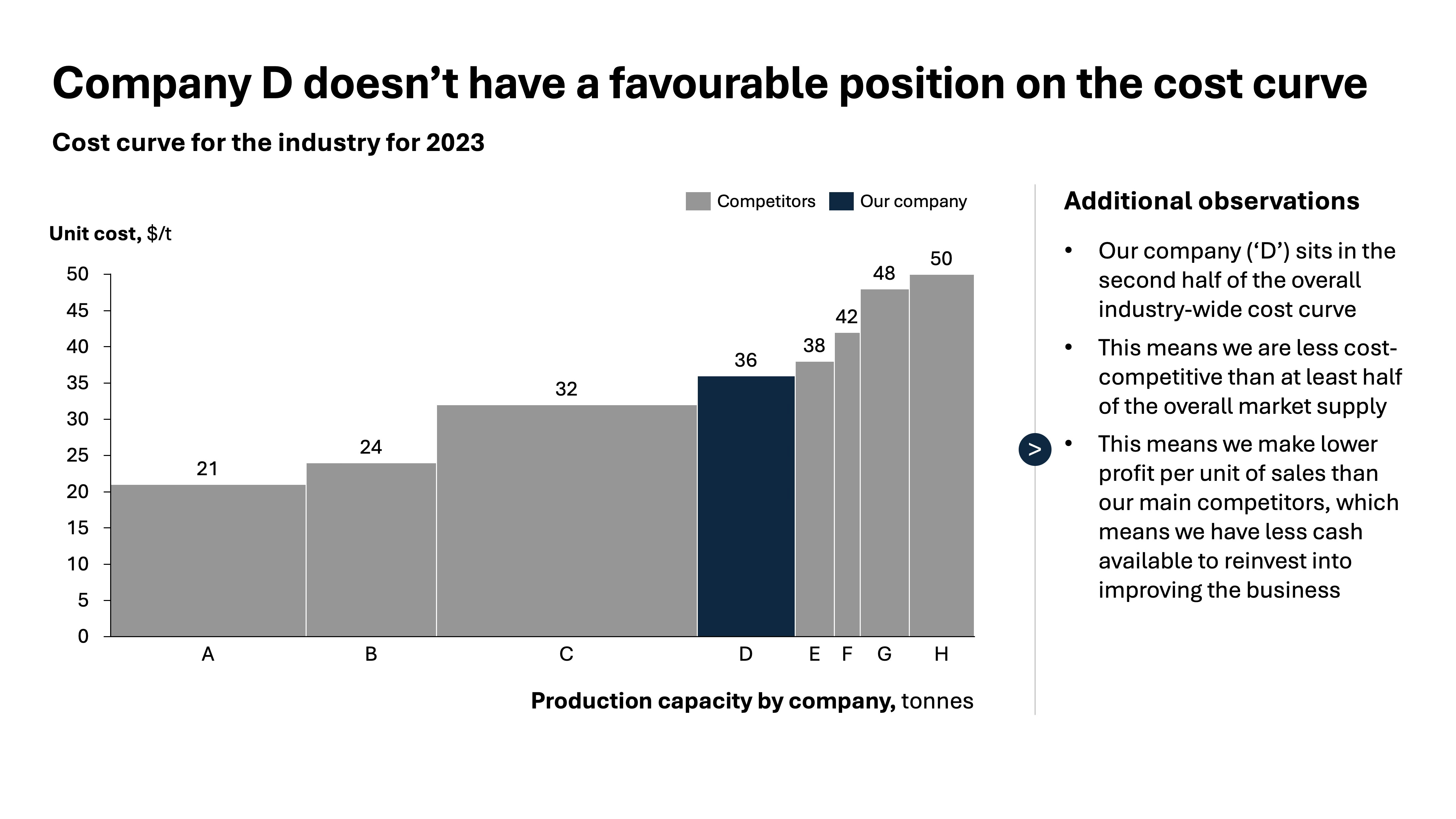
The power of the cost curve lies in what it reveals with a glance. A mining company can see whether its operations are in the lowest quartile globally, or whether they are dangerously exposed above the industry average. A procurement manager can line up suppliers to identify who is truly competitive. Strategy teams can highlight the breakeven point in a commodity market and show which players will survive if prices fall. Color-coding adds even more meaning: shading your company one way, competitors another, or highlighting the “safe zone” below industry breakeven.
But this chart demands discipline. If you clutter it with too many variables — prices, margins, volumes — the clarity disappears. Keep it simple: units on the x-axis, cost per unit on the y-axis, and cumulative volume if that helps the story. Always ensure the ranking is correct; the entire credibility of the chart rests on that order. And be careful when sharing externally — sensitive cost data should be anonymised or indexed rather than published directly. Done well, a cost curve transforms abstract benchmarking into a sharp, visual story about competitive position and strategic risk.
5. Heat map
A heat map is one of the most effective tools for making sense of complex, multidimensional data. Rather than forcing your audience to digest multiple charts or long tables, you can encode the signal in color intensity across a grid. This makes patterns, outliers, and “hotspots” jump out at first glance. In a business context, it is invaluable when you need to compare companies, plants, or regions across several metrics at once.
Let’s use this chart as an example:
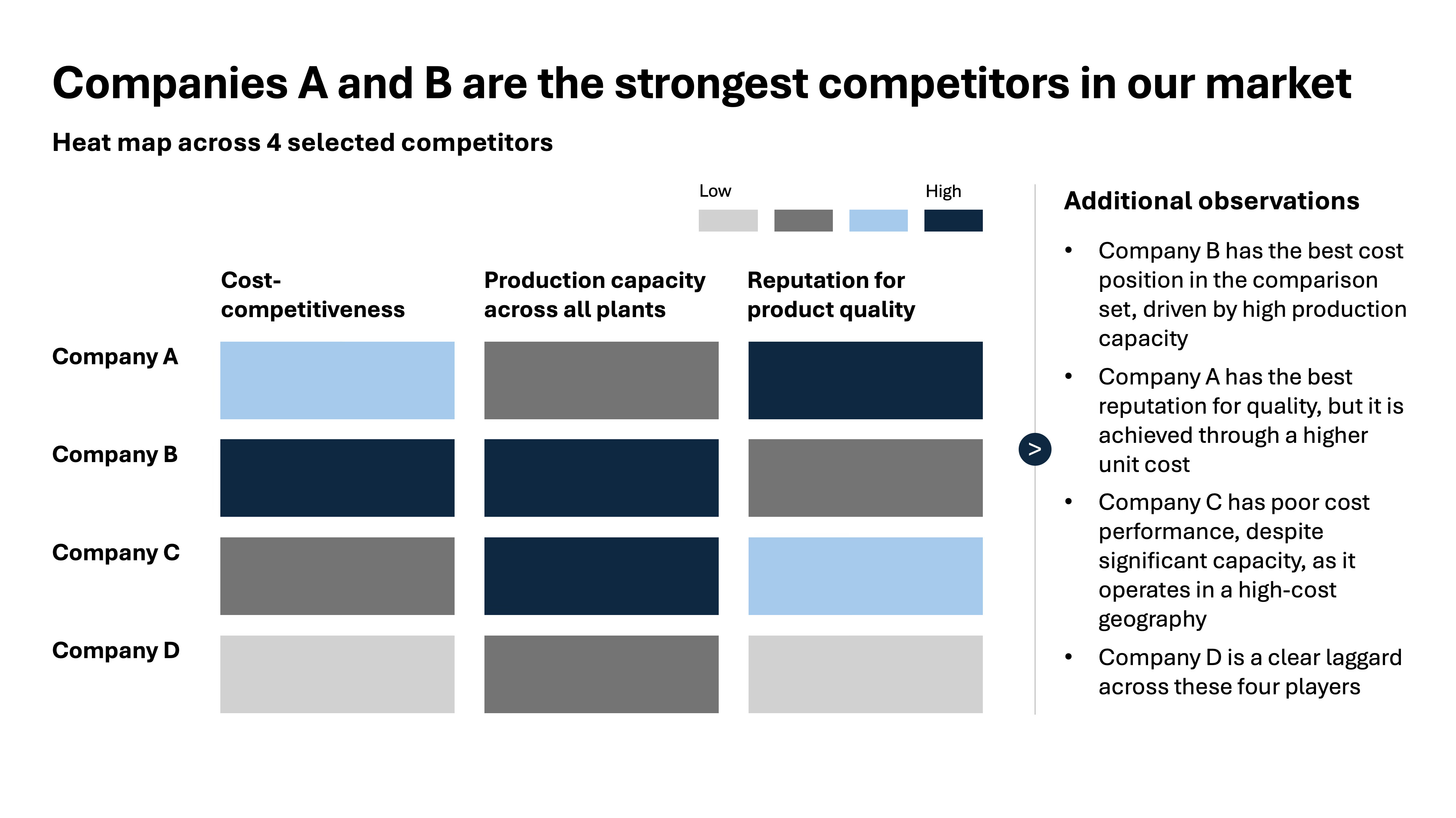
In this example, we want to show four companies, each evaluated on three dimensions — cost competitiveness, production scale across plants, and reputation for product quality. A heat map allows you to set up the companies along one axis and the criteria along the other. Each cell is shaded according to performance: darker blue for better cost competitiveness, higher production, and stronger product reputation. Within seconds, the viewer can see which company is a low-cost producer with scale, which one is niche but high quality, and which ones are stuck in the middle. It transforms what would otherwise be a messy table into a structured visual story.
The discipline is in execution. Keep the colour scale simple and intuitive — light to dark on a single hue, or a clear gradient, but never a full-blown rainbow. Label the extremes of the scale so there’s no guesswork about what “dark” means. Don’t overload the map with dozens of metrics or categories, otherwise it becomes a blur of color. The goal is pattern recognition, not data dumping. In our case, the map should help an executive understand at a glance why Company X dominates on cost and scale but loses ground on product reputation, while Company Y thrives in quality despite smaller production. That kind of story lands far better in a meeting than three separate charts ever would.
6. Process chart
A process chart is the right choice when you need to guide your audience through a sequence of steps. It’s not about data, but about flow — making it crystal clear how something gets done from start to finish. In our example of finding cost opportunities, the five steps are straightforward: clean up your data, identify high-potential areas, prioritise, select projects to activate, and begin testing and delivering value. Putting these in a simple, left-to-right flow with arrows immediately communicates the logic: this is not a random list of actions, but a repeatable method with a beginning, a middle, and an end.
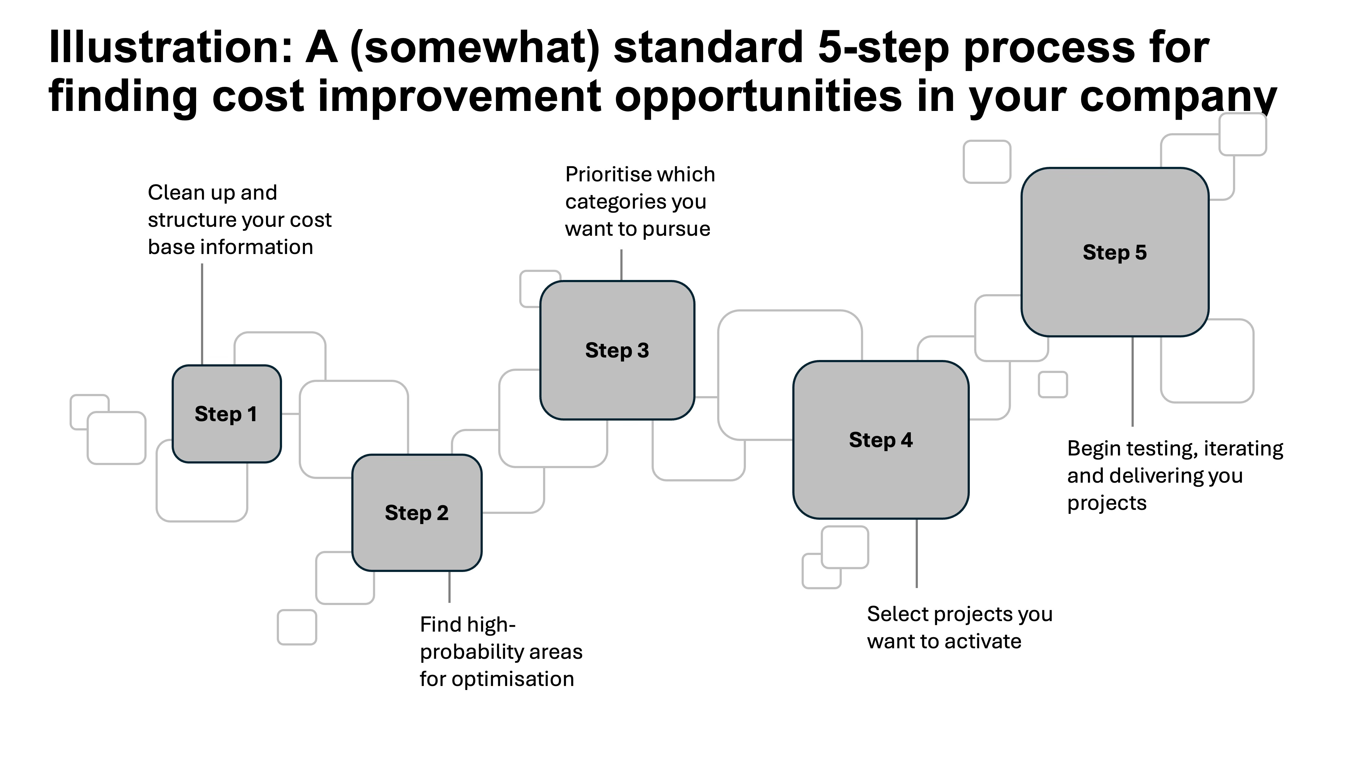
The beauty of a process chart is that it lends itself to just enough design flair. A plain row of rectangles works, but it won’t hold attention. Adding subtle touches — rounded boxes, clean arrows, a muted color palette that differentiates each step — elevates the chart from a list into a story. The emphasis should always be on elegance rather than decoration: a consistent style, clear typography, and perhaps a touch of shading or icons if they reinforce meaning. The goal is to make it visually inviting, not to overwhelm with gimmicks.
The discipline is the same as with other charts: keep it simple, and keep it focused on the audience. Five steps is perfect — digestible at a glance, but still detailed enough to show there’s substance behind the method. More than seven and the logic gets diluted; fewer than three and it feels trivial. In our case, the process chart works because it makes the approach to cost improvement tangible: the executive doesn’t just hear “we’ll find savings,” they see the roadmap of how it will happen. Elegant, simple, and structured — that’s the mark of a good process chart.
7. Text bucket chart
A text bucket chart is one of the simplest but most versatile tools in a corporate toolkit. It takes what could otherwise be a messy, free-flowing discussion and imposes structure by grouping ideas into clear categories. In the example below, the buckets are the divisions (A through D), and within each bucket the strengths and weaknesses are captured side by side. This format works because it helps executives process qualitative insights with the same ease they would numerical data — in one glance, they can see which divisions are cost-competitive, which trade on reputation, and which are struggling with adaptation or cash generation.
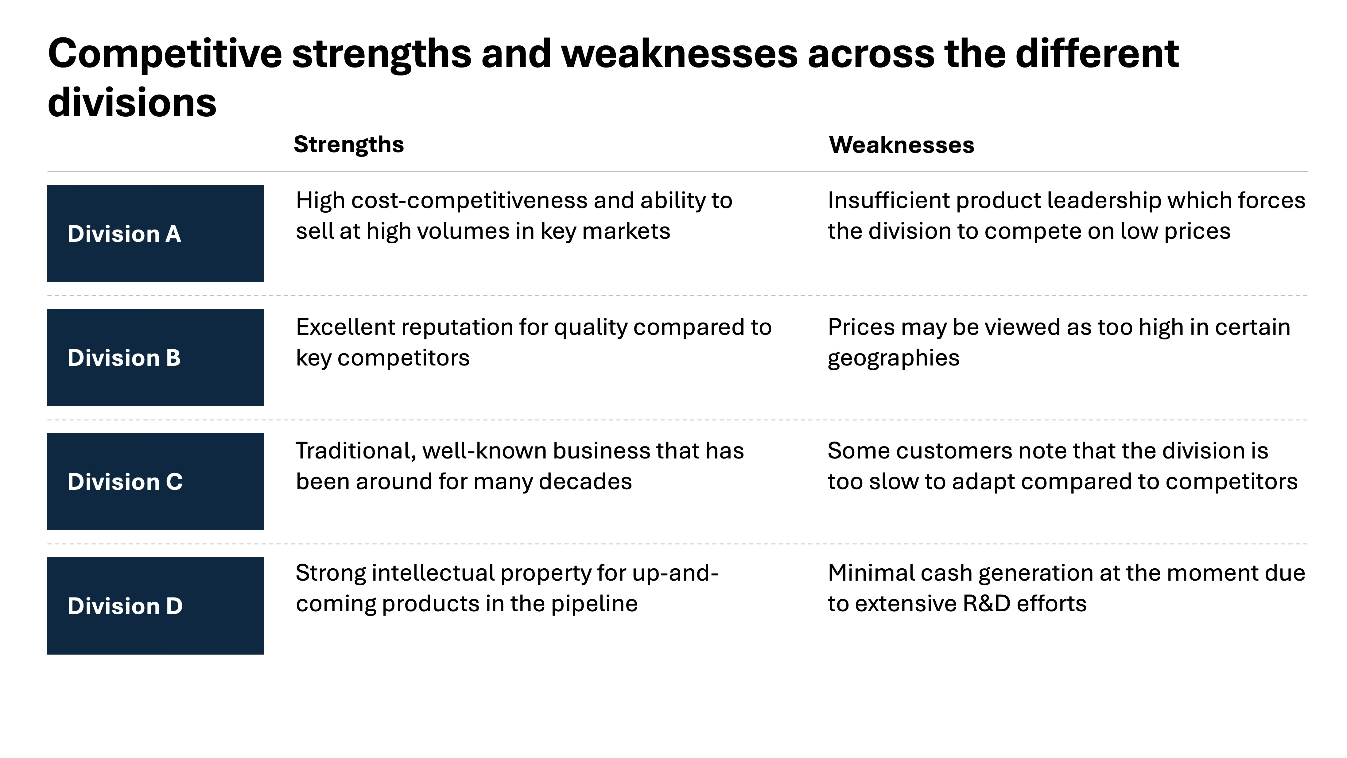
What makes the text bucket chart particularly effective is its ability to balance detail with clarity. You don’t want a long essay under each label — the discipline is to distil the essence into two or three well-crafted lines. That way, the page functions almost like a heat map for words: the reader can scan quickly, but still grasp the relative positioning of each division. In this example, Division A is painted as a high-volume cost player with weak product leadership, while Division D is portrayed as future-oriented but cash-constrained. These short, punchy formulations communicate more than an entire page of prose ever could.
There’s also a design element here. A well-made text bucket chart is visually clean: aligned boxes or rows, consistent typography, maybe a touch of shading to separate categories, but nothing excessive. You can add subtle emphasis — for instance, bolding the division names, or highlighting critical weaknesses in a different color — but the core principle is restraint. This is not about decorative design, it’s about giving structure to thought. Done well, a text bucket chart like this can transform a qualitative discussion into a sharp, memorable visual that anchors the rest of the conversation.
Here’s a strong conclusion you could use to close out the article:
So what
The truth is, you don’t need dozens of chart types to communicate effectively in business. In fact, the more exotic the visual, the greater the risk your audience spends energy deciphering the picture rather than absorbing the message. What you need is mastery of a small set of versatile, high-leverage charts — the ones that reliably turn analysis into insight, and insight into action.
The seven chart types we’ve covered — horizontal and vertical bar charts, waterfalls, cost curves, heat maps, process charts, and text buckets — are the workhorses of business storytelling. Each has a natural purpose: showing change over time, comparing static categories, walking through the drivers of a result, benchmarking cost positions, spotting patterns, clarifying workflows, or synthesising qualitative insights. Used with discipline, they can handle almost every communication challenge you’ll face as a professional.
The real art lies not in the mechanics of drawing these charts, but in the intent behind them. A good chart is a decision-enabler: it tells your audience what’s happening, why it matters, and where to act. If you can get comfortable with these seven formats — and use them thoughtfully rather than mechanically — you’ll quickly stand out as the person who can cut through complexity and make the story clear. And in corporate life, that clarity is what gets remembered, acted upon, and rewarded.