
Before & After: Fixing a Real Goldman Sachs Slide
Turning clutter into clarity

Welcome back to BI Newsletter, where we share experiences and lessons that can help improve your business, as well as your career trajectory (including the topic of this article - effective visual communication).
Sometimes even the best firms in the world get the basics wrong.
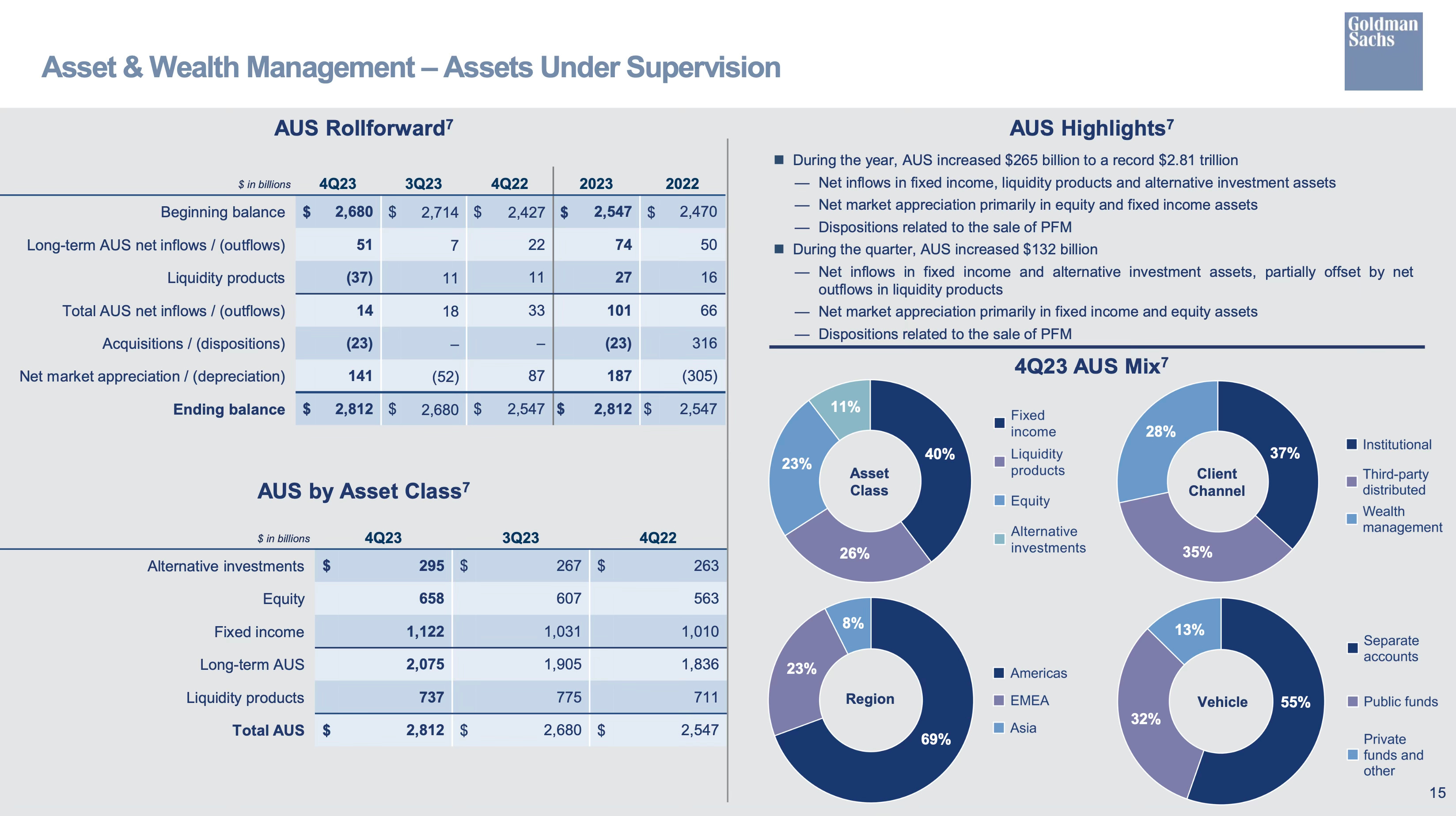
Take this slide from Goldman Sachs. It was part of a quarterly earnings pack — intended to show how their Asset & Wealth Management division performed in Q4 2023.
But if you’re a senior executive skimming this deck, or a junior associate trying to figure out what matters, you’re met with a wall of content that feels more like a data dump than a business story.
Here’s the original slide:
What’s Wrong with This Slide?
At first glance, it looks respectable — professional fonts, institutional blue tones, neat layout. But appearances can be deceptive. Let’s look more closely at what’s actually happening here.
1. There’s no real headline — just a label.
The title “Asset & Wealth Management – Assets Under Supervision” tells you the topic, not the point. It’s like someone handed you a folder with a sticker but no summary. A good title should answer the question: Why am I looking at this? What happened?
Instead, we’re left to dig through the slide ourselves to figure that out.
2. It’s unclear what matters — everything is given equal weight.
The slide throws everything at the reader all at once: two full data tables, four donut charts, and a paragraph of text all laid out side by side. No single element stands out as the main focus. Is the important story about Q4 results? Or year-on-year change? Or client mix? It’s hard to tell.
This is what happens when a slide is assembled rather than designed. There's no hierarchy — no guiding hand helping the reader process and prioritize the content.
3. The charts are more decorative than explanatory.
Take the four donut charts on the right. They show the current mix by asset class, client channel, region, and vehicle type — but they don’t show any change over time. That might be fine if the rest of the slide told the story of change, but it doesn’t.
The result? You get color and shape, but not insight. These visuals take up valuable real estate without helping the viewer understand what's changed or what drove performance.
4. Important numbers are buried in small-font bullets.
Look at the text section titled “AUS Highlights.” It’s where the real performance drivers are mentioned: net inflows, market appreciation, dispositions. But all of this is hidden in the same small font as everything else, competing for attention with the charts and tables.
And even if you do read it, there’s no clear link between those bullet points and the data. You’re left to mentally triangulate what they mean using the tables on the left — a cognitive burden that could have been avoided.
5. There’s no story flow — just parts.
Ultimately, the biggest issue is structural: the slide is a collage, not a narrative. It doesn’t walk the reader through a clear arc. There’s no beginning, middle, or end — no “so what.” That might be forgivable in a technical appendix, but not on a slide that appears this early in the deck.
Now Compare It to the Remake
This version of the slide (which we created) tells the same story — but in a way that’s dramatically easier to follow. Let’s walk through the changes and why they work.
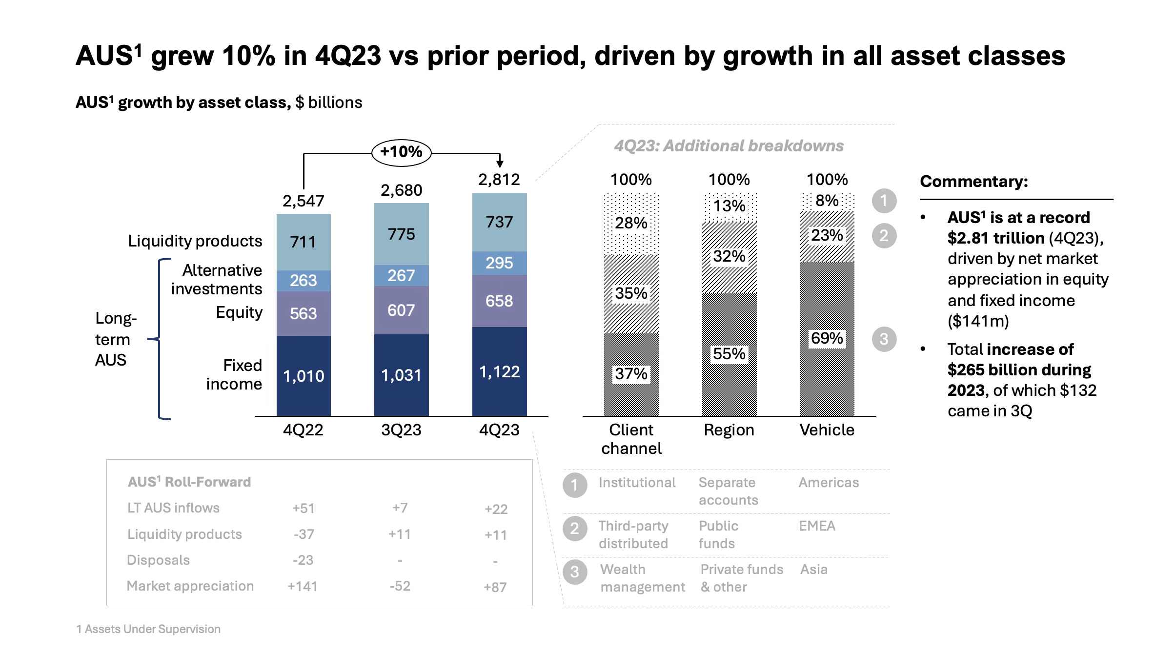
How the Remade Slide Fixes the Problems
It starts with a clear, insight-led headline.
“AUS grew 10% in 4Q23 vs prior period, driven by growth in all asset classes.” This is what the original slide failed to do — tell the reader what happened and why it matters, right at the top. The message is now instantly clear: there was growth, it was broad-based, and it happened in Q4.
It features one main chart that does the storytelling.
Instead of overwhelming the viewer with tables and donuts, the remake uses a single vertical bar chart to show AUS by asset class over three quarters. You can immediately see:
The total growth (from $2.55T to $2.81T),
Which asset classes contributed,
And how the mix shifted slightly over time.
This is where the story lives — and now it’s easy to see it.
It uses supporting visuals carefully and clearly.
To the right of the main chart, three smaller stacked bars show the 4Q23 breakdown by client channel, region, and vehicle. These aren’t shouting for attention — they’re toned down in grayscale — but they provide helpful context for those who want to dive deeper.
The previous donut charts are gone. And we don’t miss them.
Key performance highlights are pulled out and emphasized.
The key drivers — $141B in market appreciation, $265B total increase in AUS — are no longer buried in a sea of text. They’re highlighted in a small commentary box on the right, using bold text and spacing to guide the eye.
A busy exec can skim these in 5 seconds and walk away with the takeaways.
The data table is there — but in its proper place.
Instead of dominating the slide, the roll-forward data is tucked away at the bottom in a light grey box. It’s there for completeness, but it doesn’t distract from the narrative. This is how reference data should be treated: as backup, not the main act.
So What Can You Learn From This?
If you regularly present performance updates, financial results, or operational dashboards, this example is worth studying. The redesign shows what can happen when you treat a slide as a communication tool — not just a reporting vessel.
It’s not about adding polish. It’s about sharpening the story.
3 Lessons to Take Into Your Next Slide
Lead with the message, not the metric. Your headline should tell the story, not describe the chart.
Less is more — but only if it’s better. Strip back noise, elevate what matters, and let one chart do the storytelling.
Design for humans, not just analysts. Use layout, spacing, and structure to help your audience think less and retain more.
If this was helpful…
We’d love to hear your thoughts.
Was the breakdown useful?
Do you have slides you’d like help improving?
What’s the biggest challenge you face when trying to tell a clear story on a slide?
👉 Drop a comment, ask a question, or just say hi.
👍 Like this post if it gave you a new way to think about visual communication.
📩 And if you know someone — a teammate, colleague, or friend — who builds slides regularly, forward this to them. They’ll thank you.
Helping more professionals communicate clearly is the mission. Every share helps.